End-to-end structure for a landing page that converts.
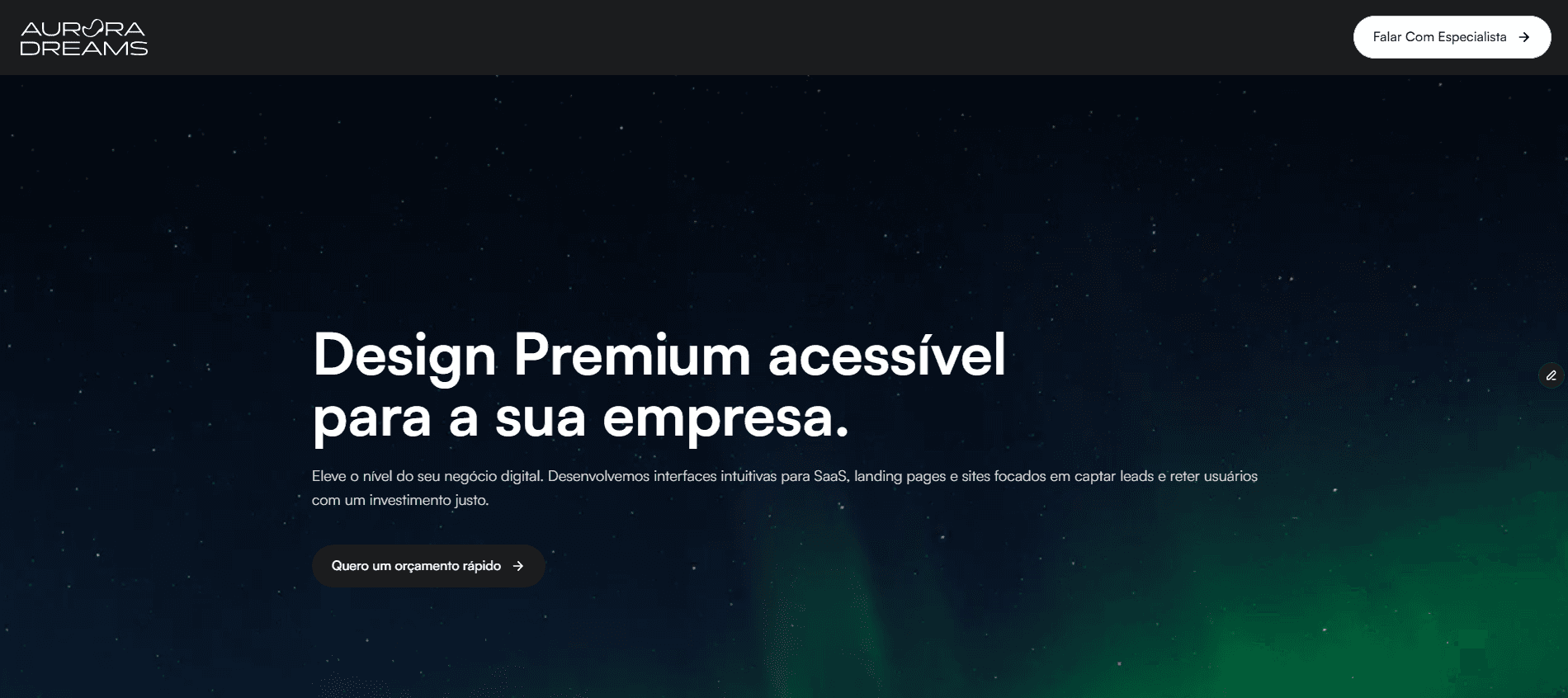
Rebranding and a new landing page architecture for a premium design studio, focused on positioning and conversion rate.
The Problem
Diluted positioning
The previous page failed to communicate the studio's premium positioning. Visitors scrolled halfway down the screen and left.
Conversion below potential
Conversion rate stuck below 1.2%, even with qualified traffic coming from referrals.
Process
I mapped journeys, interviewed 8 recent clients and rebuilt the narrative hierarchy. Every iteration was tested with real users in moderated sessions.
I analysed 12 direct competitors, ran a card sort with prospective clients and read more than 200 messages from the sales funnel to understand recurring objections. The low-fidelity wireframes prioritised a single call to action per section — three structures were rejected before we reached the final flow.
The Solution
Single-column narrative
A one-column page with editorial typography and social proof anchored in results. Each section answers a specific objection found in research.
Results
Conversion
From 1.2% to 4.7% in 90 days.
Engagement
Average session time 2.3× higher.
Retention
Bounce rate down by 38%.
Takeaways
Less is more when every element carries intent. Trust comes from clarity, not from the amount of information on screen.